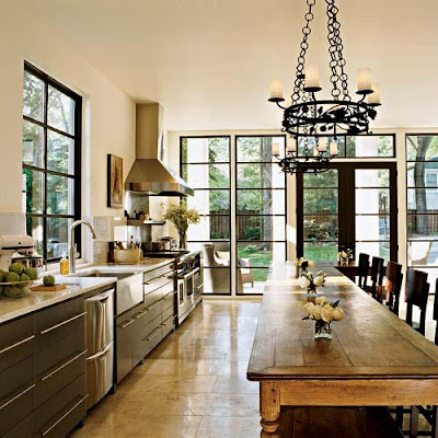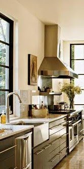
We can learn so much from dissecting rooms & spaces. It's one of the things that I love most about blogging: when you have to verbalize something, you end up forming opinions & making insights you may not have if you hadn't tried to explain it writing to others. I thought I'd share a photo of one of my favorite kitchens from Southern Accents. The owners designed the entire kitchen around the 18oos 17 foot L-shaped oak table from France. Now I know most of us don't have the space or luxury of designing a kitchen around a 17 foot antique table, but we can dream, can't we? (And learn from it!!)


I think the important thing in looking at rooms we love that we want to emulate, is that we figure out how to make it work for our personal application. This kitchen above is massive... Not very normal. But how can we apply the principles used in creating this beautiful space to our own homes? Pretty easily. Just break down each element.
I know most of you are as design-obessed as I am (and probably do this already in your own blogs & at home) but I also know some of you are looking for some tips & tricks to get your home just right.
Lots of times we love rooms because of the overall feeling or atmosphere so it really helps to break them down. If you have photos of rooms you love, just figure out what you love about each space and write it down. 1-2-3, a-b-c. And then the most important part is to apply it to your space. Figure out how you can achieve each element in your own space. (maybe on a smaller scale or with different materials, get creative so you're not copying and it's personal to you, etc.) Write down an example next to each element. It really helps!!
xoxo,
lauren

 As a decorator & a textile designer, this is my place to muse... perfection doesn't interest me; Reality and charm do. Fresh floppy flowers from the garden over long-stemmed roses any day, I love it when things are slightly off and tell a story.
25 comments:
It is an amazing space. The windows! (also dream of having steel windows) What a great idea they used here to get the look of them. And the lack of upper cabinets, letting the light shine in, wonderful. I hadn't noticed the table was an L shape until you mentioned it, even though I've seen this image before! Thanks for pointing it out...how cool is that?
Janell
p.s. check out my light fixture when you get a chance! No orange glow!! Thanks...Janell
This kitchen is stunning and perfectly encapsulates that element of openness and coziness all at once. That is a feat indeed! I love the way you broke down your thought process...you're right, design-obsessed minds think alike!
This is a very good post Lauren!
Good tips ! And a beautiful kitchen!
I also love the juxtaposition of old and new here!
Greet
Great lesson, Lauren. It's hard sometimes, when you're so enamored of an entire space to break it down and figure out why... YOU might love ALL of it but IT might not all be right for your space. I hate when that happens!
I love all those windows, it's like a solarium. I completely LIVED by inspiration photos during our remodel. I think pictures can do such a better job than words sometimes (especially when expressing your desires to contractors). I actually just posted on one of my inspiration photos and I was amazed at how similiar the inspiration room and the my room are. Everything is different (different table, different cabinet, different chairs) yet the feel of it is very similiar. It's really quite fascinating! Wouldn't it be fun to compare ones inspiration photos to the rooms they were meant to inspire?! xoTrina
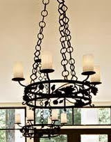
It really is helpful to break down what it is we like about particular spaces. And more difficult than one might think! I LOVE the chandeliers in this room- to me, they serve as the bridge between old and new. An old-world style but still modern.
Thanks for a great post!
I think this is a great idea. For not only a typical home owner, but a working professional in the field. It's great to sit down and look at images and pick it all apart to see what ingredients came together to make the room the way it is!
thanks for the tips! I do spend a lot of time trying to get ideas from magazine pictures!
Way to break down the components!
I love how they have all the chairs on just one side....and those windows! I have metal windows...but theyy are yucky silver...I had been toying with painting them for a long time. Think I'll give it a spin!
Love this kitchen. And those WINDOWS. To die for. Great post!
I love this kitchen (especially the windows and the table). And I completely agree with you about breaking down images. I need to start being better about it. Great post!
This kitchen is beautiful. I really love the antique table. It really adds charm next to those modern cabinets. And those windows are fabulous! Great tips.
Chelsea
How beautiful! Makes me want to rip out all my upper cabinets - but what to do with all that stuff?
Lauren you are awesome. Dissecting a room is the best way for me to explain to my husband what I like. It wasn't until I showed him a picture of what I like and why did he understand what I wanted to do with our house.
Great post! I love the kitchen as well.
I always love your willingness to TEACH. Great post Lauren, hope you are well!
You have stated some very good tips on how to break down a photo of a room to work for your own space. All the elements in this room are fabulous, but I think you are exactly right about how light the room is yet so cozy and inviting. Great post!
marcie
What a beautiful kitchen! And that table... oh my! The house we stayed in near Perugia in Umbria this summer had a wonderfully long oak table, but this table leaves it in the shade! Some day, some day....
Great post! And what a table!!!! Wow. enjoyed your "dissecting the room", I do that too as a rule and on my blog .... it just helps put in perspective why something works and why you like it.... Gena
The table really does make the room, I love how they used it as extra prep space as well as a dining table.
That is a stunning kitchen and I love it for every reason you do!! I love your style Lauren!
I am seriously lusting after that kitchen! Great post! Can you tell me what month/year in was featured in SA? It is the inspiration for my next kitchen for certain! Thanks! xoxo Rita
Love it all.
Post a Comment