
In the post I did on my office, I mentioned my Style Files & a few of you were interested in how I organize them. My Style Files are a set of binders (that's them above, in the winebox) that I house all of the pages I've ripped out of magazines & printed out from blogs. They're my inspiration files & I can always go back & read an article or look at photos for ideas.
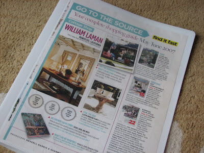 I have 14 different categories & I separate all the pictures into separate style files. Each file is in a binder & I put the torn out pages into clear page protectors. I also save all of the 'resources' sections from the back of the magazines and put them in a separate folder in case I need anything for future reference. I always make sure to write the month & magazine name at the bottom of each photo (if it's not there already) so I can easily find anything in the resource folder if I need it later. (I didn't used to do this in the beginning & regret it!!)
 I chose 14 categories because it worked for me (I could probably have done more) & because I had storage boxes that I wanted the binders to fit into perfectly. (ha! I know, I can be OCD at times!) But I really like having the files transportable so I can take them around the house with me: into the living room to watch a movie or (eeesh, should I be admitting this?!!) into the bedroom

 I tear out all the pictures from magazines & put them in page protectors when we're watching a movie. That pile then gets put into all the different binders. But I keep one of these big baskets (below) as my filing basket & all the pages waiting to go in stay there because I'm never done. As my tastes evolve, I also recategorize the rooms and I get rid of pictures I'm not interested in any more.
  Just to warn you, some of these categories & the pics I've put into them may seem out of left field, so don't think I'm crazy!! I realize there's a lot of overlap & the point of the Style Files is for you to be able to to have a reference that works for you. So this-however illogical it may seem! - works for me. :)


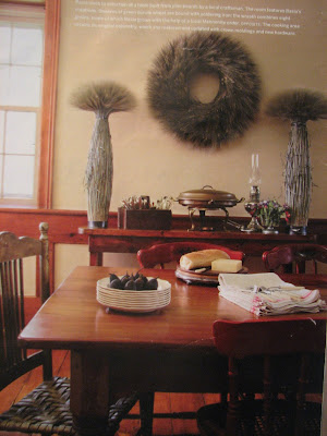
 3. "Vibrant- Bohemiam- Eclectic" These rooms have bright colors & feel as if they were created over time with collected items. A world-traveller might live here. Or a hippie. The items in the rooms are interesting & the rooms have that laid-back collected look.


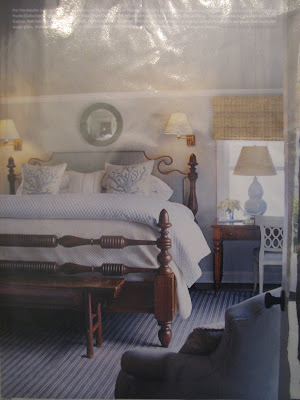
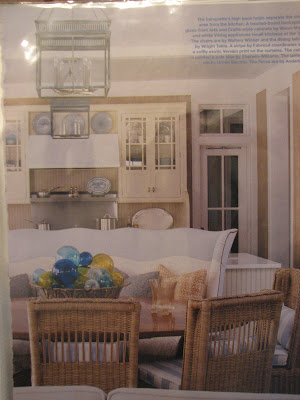

 5. "Today's Cottage" These homes are usually a play of old & new. Theyhave those older, charming, cottage elements to them but they are also infused with modern furnishings & elements. You feel as if you're in an older home that has been brought perfectly into today.


 10. "Rustic Elements" This one is fairly self-exaplanatory & has rustic elements such as raw beam celings, stone fireplaces, rough hewn furniture, and antlers. Some of these rooms are surprisingly quite refined.


 11. "Villa Style" These homes are huge & typical of an Italian or Spanish villa or Mediterranean- style homes. They have cathedral ceilinegs, and can have some rustic elements &/ or Moorish & Tuscan elements. I don't do much of this and so again, lots of different styles have been squeezed into one file but it makes sense for me.



 I have 14 different categories & I separate all the pictures into separate style files. Each file is in a binder & I put the torn out pages into clear page protectors. I also save all of the 'resources' sections from the back of the magazines and put them in a separate folder in case I need anything for future reference. I always make sure to write the month & magazine name at the bottom of each photo (if it's not there already) so I can easily find anything in the resource folder if I need it later. (I didn't used to do this in the beginning & regret it!!)
  I chose 14 categories because it worked for me (I could probably have done more) & because I had storage boxes that I wanted the binders to fit into perfectly. (ha! I know, I can be OCD at times!) But I really like having the files transportable so I can take them around the house with me: into the living room to watch a movie or (eeesh, should I be admitting this?!!) into the bedroom
The more categories you have, the longer it takes you to figure out which file to put which pages into, but it's also more rewarding in the end, because the articles are easier to find later and it forces you to really analyze the articles & photos & to exercise your design brain. You really start to evaluate the details & I think once you're forcing yourself to categorize information like that, you're honing your eye & becoming more critical & growing as a designer/ decorator/ homeowner. You'll develop favorites & learn why you love those spaces and it'll help you create your own spaces (below):

The catgeories I came up with work for me & may help you figure out your own categories, but it's a very subjective thing & how you categorize rooms (because so many are such a combination of styles) is really up to you. I go with what feels the strongest to me when I look at the room. Sometimes a room will be in a rustic farmhouse & have more modern furnishings... if I'm more interested in the farmhouse details & architecture of the room, then I might file it under "Farmhouse/ Country Elements," but if I thought I would use it more as a reference for the furnishings, it might go under "Modern Elements." Some of my categories are based more upon furniture styles and others are based more upon feelings. It's not exact by any means. And lots of times I change my mind later; it's a process.
 I tear out all the pictures from magazines & put them in page protectors when we're watching a movie. That pile then gets put into all the different binders. But I keep one of these big baskets (below) as my filing basket & all the pages waiting to go in stay there because I'm never done. As my tastes evolve, I also recategorize the rooms and I get rid of pictures I'm not interested in any more.
  Just to warn you, some of these categories & the pics I've put into them may seem out of left field, so don't think I'm crazy!! I realize there's a lot of overlap & the point of the Style Files is for you to be able to to have a reference that works for you. So this-however illogical it may seem! - works for me. :)
Ok, so here are my categories: (and I apologize for the image quality- I used photos of my actual Style Files!!)
1. "Feminine Cottage" The rooms feel feminine & pretty to me. They're not usually in massive, grand homes & they typically have pale colors, maybe skirts on the furnishings, maybe lots of florals, but there is a definite soft, femine quality to these spaces.


2. "Farmhouse/ Country" These rooms have farmhouse and/ or Country elements to them. Maybe simple early-American furnishings or country kitchens or gingham, but whatever it is, it has this feeling for me when I look at the room.


 3. "Vibrant- Bohemiam- Eclectic" These rooms have bright colors & feel as if they were created over time with collected items. A world-traveller might live here. Or a hippie. The items in the rooms are interesting & the rooms have that laid-back collected look.


4. "Coastal" These homes feel like they could be on the water & usually are. Lots of whites & blues & nautical items like lanterns & coral, although the color schemes don't always have to be blues & whites. They feel airy & open.


 5. "Today's Cottage" These homes are usually a play of old & new. Theyhave those older, charming, cottage elements to them but they are also infused with modern furnishings & elements. You feel as if you're in an older home that has been brought perfectly into today.


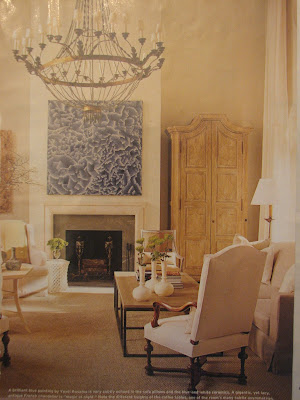
6. "Transitional- Calming" These spaces are transitional in style & have a calm, cool feeling about them. They can be similar to "Today's Cottage" rooms but are usually larger & a tiny bit more refined. They tend to be cool neutrals and have some neoclassical elements, usually mahogany, & feel restful & open.


7. "Transitional- warm" These spaces are also transitional & fairly neutral, but they have a warm, cozier feeling about them. There are often piles of books and warm walnut woods in them. These rooms are open & feel very stylish.


8. "Modern Elements" {I'm not huge into modern, so this is my one file and it unfortunately smashes a range of different styles into one} These spaces just feel modern to me- many of the ones I've collected have some warm or natural elements.


9. "Glam Elements" These rooms usually have lots of sparkle & feel swanky. They often have art deco elements & maybe bold feminine colors such as fuscia or purple. They range over a bunch of different furniture style s& can be modern or traditional, but the overall feeling is "glamorous" and there's often a lot of fun energy in these rooms.


 10. "Rustic Elements" This one is fairly self-exaplanatory & has rustic elements such as raw beam celings, stone fireplaces, rough hewn furniture, and antlers. Some of these rooms are surprisingly quite refined.

 11. "Villa Style" These homes are huge & typical of an Italian or Spanish villa or Mediterranean- style homes. They have cathedral ceilinegs, and can have some rustic elements &/ or Moorish & Tuscan elements. I don't do much of this and so again, lots of different styles have been squeezed into one file but it makes sense for me.


12. "Provincial" These spaces are more rustic versions of formal European styles, such as "the Louis's." They may include furnishings from Sweden, France & other European countries, but they are less grand versions of their formal counterparts.


13. "Formal European" These rooms feel grand & have formal elements that make me think of the styles of the courts. They often include silk, taffeta, formal draperies and/ or lots of ornamentation depending upon the room.


14. "English Elements" These spaces may have traditional English furnishings mixed in with modern pieces & so these rooms can be modern or traditional, but have enough English elements that they make me think "English."


And there you have it!! :) I guess the most important thing here is that the files give you a way to categorize all of the images & stories we're constantly finding so you can use them. I make inspiration boards for clients from all of these images (photocopies of them) & it's so easy & fun when they're categorized.

So what are your favorite categories? Any speak to you?
xoxo,
lauren

 As a decorator & a textile designer, this is my place to muse... perfection doesn't interest me; Reality and charm do. Fresh floppy flowers from the garden over long-stemmed roses any day, I love it when things are slightly off and tell a story.
28 comments:
holy smokes.
I'm a newbie..I have one file. it is a cute greek key binder from target though.
I love this idea. Thanks for letting us in on what your binders contain. I'm normally so organized, but my tear sheets are a mess. Normally I just end up folding corners in magazines, because I'm so sad to actually rip out the page. I need to hop on this and get myself organzined. Plus it is pretty inexpensive to do. Those little binders don't cost much at Staples. You've inspired me to start this. Plus it's great that you rememeber to save the resource pages!!!! Very helpful.
Fantastic idea! I need to do this.
Thanks soo much for all the info!!!I def. love today's cottage and glam elements!!! I need to get more organized. Thanks for sharing:)
i envy your organizational skills! i do this with recipes and event planning ideas from magazines...complete with the page protectors and everything. yay for being organized!
the room that spoke to me the most is 'glam elements' LOVE the 2nd & 3rd pics specifically!
Lauren, I decided to comment before I read the other comments because I don't want them to skew my comments. I love your categories and got a great kick out of reading your descriptions. I LOVE that you do this, that you are so organized. I don't have style files like yours, but I am constantly categorizing rooms in my mind and also trying to label them. I always struggle with the categories and what to name things and I keep wanting to come up with this ABSOLUTE naming system that works perfectly but it never does. Rooms are always such weird combinations, but you have nailed down the key elements beautifully!
What a wonderful system and I am so happy it works for you. I really don't know how you categorize some rooms but I envy that you have a system!!
My favorite style is probably transitional-calming (in my mind, I call this sort of look "pared-down traditional" which has refined traditional elements but is cool, simple and calm and has modern touches).
Yours are awesome categories. Like you, I lump modern into one big lump because it isn't my taste either, but I do think you might consider separating "Modern Country/Rustic" from "Modern Modern" (you know, those cold white spaces with all modern furniture and expensive Eames chairs etc). I actually like Modern Country too.
GREAT post! Very inspiring and I will have a look at your categories again.
xox Terri
How awesome of you to share your system! It's so impressive and I love your categories. They totally make sense to me. My current mood would definitely fit "Vibrant- Bohemiam- Eclectic". Where's that first photo in the category from? I must have it for my files!
great post, I like so many styles...what's a girl to do?
I have done this for years and have so many files stored away. Before I entered the whole blog world my friends though I was seriously nuts and needed to be committed. Now that I show them im not the only one they think its a little more normal, and have even started doing it themselves.
I love how you seperate yours, I think I need to go though mine and change them all now- I just have Kitchens, bedrooms, bathrooms etc etc. Oh, and I think my favorite is your glam file.
PS- Im going to trader joes to make them give me wine crates now, im loving yours!
I'm new to your blog...but this is a wonderful post! So inspiring. I do things like this but on a much smaller scale, not as organized and in a more "artistic journal" way. :)
Thanks for sharing.
Great post! I have a file cabinet full of folders of images I have collected over the years and organized by room, then the element that most spoke to me within the design. I did seriously consider binders using page protectors, but a many of the magazine pages I have clipped are too big to fit within the confines of the page protectors. I have both legal and letter size protectors, but my larger pages (Veranda, House Beautiful & Garden Design come to mind) don't fit into either of these and I can't bring myself to cut them smaller. Do you have this problem and have you figured out a solution yet? I also especially love having the images organized in folders on my laptop computer that I can browse through using filmstrip view, but scanning is so time consuming! Thanks for sharing- I thoroughly enjoy reading your blog!
Onthefarshore- I'm totally a folder!!! (I was probablyone of the few disappinted ppl when House Beautiful's pages got larger!!!) I hate to fold the pages but I feel it's better than cutting :)
Lauren- Thanks for posting this info. I think I lean more towards Today's Cottage/ Transitional...even though I am still trying to figure out what style I am! I can't wait to go update my files!
OK, so I finally committed to just one style favorite! European Formal it is! .....though I do love your English Elements too....and then there is Villa Style lol I think I need an Eclectic category. Oh, well, at least they all share some European influence.
Yet another fabulous, thought provoking post from you Lauren!
I too have a style file, with each page in a clear plastic sleeve. I even guilotine the rough edge where I have ripped out the page!
I only have one style file, but it is a great big fat one - I really need to split it into two because it is getting too heavy to pick up.
I organise mine very simply - it has labelled tabs for each section, with the beginning of the file for complete houses that I love every bit of, then the rest is divided room by room. I find this works for me, mainly because they are all pretty much one style!
One thing I do is hang on to all my photos, I don't turf any out, even when my tastes might have moved on. I enjoy seeing how my tastes have evolved over time, I love to see what I used to love, some of them make me laugh, and some of them remind me of specific times in my life.
So Lauren, I thought I was organized, but you keep proving that I'm totally not!
Glam elements are a clear no 1 for me probably combined with formal european and today's cottage. Love your posts as always! :)
dagny
Mine are categorized by room, and then I have a seperate file for entire houses that I loved. But this seems like a good idea too. I didn't start keeping sources soon enough and I regret that!
I recognized so many of these images. Sigh ... I miss Cottage Living.
What a great idea! I have hundreds of images that I just keep together, but when it comes time to finding them I never can! This will make my life/blogging so much easier! I love that you have narrowed down the number of files you have. I always make too many categories, which also never works! Oh, and I don't think it is ODC at all that you make the number of files equal to how much storage room you have, imagine if you would have had 3-4 more style files, they would just be so messy and get in the way! Thanks again for the great post!
Lauren - Such a wonderful idea. All of my tear sheets are stuffed in a drawer and occasionally I go through and toss the ones that don't really appeal to me anymore. Your version is much neater and more organized.
Many of the images that you show I have torn out myself. It's no wonder I love your blog so much. :)
Lauren---you must never sleep I dont know how you keep all your tearsheets organized! I have an enormous binder with file tabs, but before they go in there they go in a big orange box and I try to get to it 1xweek, which turns into 1x a month. But its so helpful to keep ideas on hand. I agree categories are hard---some of mine are "rooms I like," "love this," " nice sink," etc etc etc! Keep up the good work!
Lauren, we didn't go play yesterday, but we're definitly going this weekend. I just got her some Stonze booties, and they're really great for this amount of snow!
What a wonderful tool- and so very organized. Thank you for sharing that-I'm always on the lookout for more organizational ideas. You have some great catagories-love them all.
I have been waiting until I had a lot of time to read this because I knew I would need to study your system. For years I have been tearing stuff out and putting them in binders as inspiration, but it wasn't until I started blogging (just a few months ago) that I realized how badly I needed what magazine it was from and the resources! Ugh! It has become a problem. I must find a better system going forward! Yours is great!
I used to tear out magazine pages I loved and put them into binders when I was dreaming of having a big house someday. Then I got a big house and it all went out the window :)
Now I just keep the magazines I love and pour through the pages often.
Wow, I'm so impressed! Will you come to my house and organize please??
-Lana
Hi everyone! Let me say this: This is my system but I am ALWAYS behind!!! :) It's definitely a very organized system but one that's easy to fall behind on. Every couple of months I watch a bunch of movies & try to get it all in order. (I'm probably about 6 months behind right now!!!! :)
Lauren - this is fantastic! Thanks so much for sharing your sytem and your categories. You may be 6 months behind in your filing, but you're ages ahead of me - I don't have a system!!! But it's time I organize and I believe I'm going to try and incorporate something similar to yours.
Thanks again!
Victoria @ DesignTies
lauren, thanks so much! this is perfect. just the info i needed. i can't wait to sit down with my old style file and my new (and not so new)magazines and get to work! i loved reading all of the comments too. it would be fun to know what magazines eveyone subscribes to. sadly, the magazines these days are getting thinner and thinner and i too am still mourning the loss cottage living- an all time fav.
Post a Comment